When producing graphic overlays, precise color matching is crucial to ensure consistency, brand identity, and quality. One of the most reliable systems for achieving this consistency is the Pantone Matching System (PMS). In this article, we’ll explore why Pantone colors are widely used in graphic overlay production, how Pantone colors work in printing, factors influencing Pantone color usage, and key considerations when using Pantone color guides.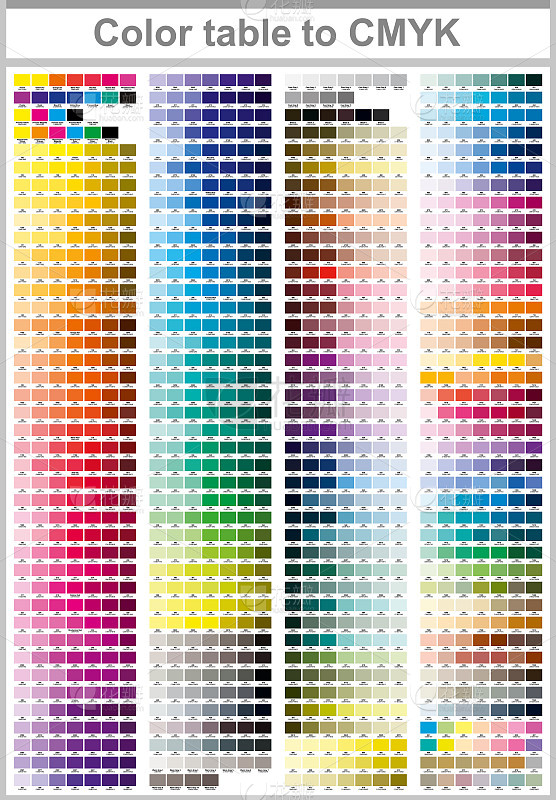
The Pantone Matching System (PMS) is a standardized color system developed by Pantone Inc., designed to help industries achieve consistent color reproduction across various materials and processes. Each Pantone color has a unique code that ensures the same color will appear identically, regardless of where or how it’s produced. This consistency is particularly important in graphic overlay production, where accurate colors are essential for brand recognition and product appeal.
Using PMS also means that Pantone colors can be referenced globally, making them ideal for companies working with multiple vendors or printing processes. The system’s accuracy is based on precise color formulations, which helps avoid discrepancies that can arise with other color models, such as RGB or CMYK.
In printing, Pantone colors differ from the CMYK process used in most color printing methods. While CMYK is a four-color process combining cyan, magenta, yellow, and black to create a range of colors, Pantone colors are typically pre-mixed inks, offering more precision for specific shades. This makes Pantone ideal for achieving colors that CMYK may not accurately replicate, such as vibrant reds, deep blues, or custom shades.
For example, if a company logo uses a specific Pantone color, graphic overlay production can use PMS codes to match the color exactly. In CMYK printing, however, slight variations are possible due to color mixing, which can lead to inconsistencies, especially when printing across different materials or locations.
While Pantone provides excellent color consistency, several factors can still impact how these colors appear in the final product. Here are three primary factors to consider:
Printing Ink Material
The type of ink used can influence Pantone color accuracy. Different materials, such as solvent-based, UV, or water-based inks, interact uniquely with Pantone colors. For example, UV inks may alter the vibrancy or undertone of certain Pantone colors due to the way UV light affects pigmentation. Choosing compatible inks is essential for ensuring the Pantone colors stay true to their intended shade.
Computer Display Colors
Colors displayed on a digital screen, such as RGB models on computers, may not accurately represent Pantone colors. Screen displays use light to produce color, which differs from how colors appear in printed form. For accurate Pantone color selection, relying on a physical Pantone swatch book rather than a computer display is advisable. This approach prevents color discrepancies that may arise from screen calibration or color model differences.
Ambient Lighting Conditions
The lighting in the production area can impact color perception, especially when comparing color samples. Pantone colors may look different under fluorescent lighting compared to natural daylight or LED lights. Inconsistent lighting can lead to variations in color matching, so it’s best to evaluate Pantone colors in natural light or under controlled lighting conditions to ensure they match the desired shade.
Using Pantone colors can streamline the color matching process, but there are some essential guidelines to keep in mind:
Check for Pantone Guide Updates: Pantone color guides are updated periodically to reflect new shades and formulations. It’s best to use the latest Pantone guide to ensure accurate color matching, as older guides may fade over time or lack newer colors.
Use Physical Swatches for Color Matching: When selecting Pantone colors, always use a physical swatch book rather than digital displays, as colors viewed on screens may vary significantly.
Communicate Clearly with Printers: If you’re working with multiple printers or materials, communicate the exact PMS codes for consistent results. Be sure to specify whether you want spot Pantone colors or if a CMYK conversion is acceptable, as the latter may lead to color variations.
Be Aware of Material Limitations: Some materials, like fabric or certain plastics, may not replicate Pantone colors as accurately as paper or coated surfaces. Consulting with your printer about material compatibility is essential for achieving the desired color output.


