Colors on a graphic overlay may represent a brand, identify a control area, separate different functions, or support the overall appearance of the equipment. Clear color information is therefore an important part of the artwork supplied for production.
The Pantone Matching System, commonly known as PMS, gives designers, customers, and manufacturers a shared method for identifying colors. This article briefly explains where the system came from, what it supports, and how Pantone color references are used in graphic overlay printing.
Pantone introduced the Pantone Matching System in 1963 as a structured method for selecting and communicating colors in the printing industry. Instead of describing a color only as red, blue, gray, or green, the system assigns a specific name or code to an identified color.
This gave designers and printers a clearer way to discuss color requirements. A customer could specify a Pantone code in the artwork, and the production team could use the same reference when reviewing the printed design.
Pantone has since developed color systems for different design and manufacturing fields. The company describes its system as a common color language that supports communication throughout the workflow between brands, designers, and manufacturers.
Pantone color matching provides a clearly identified reference for printed colors. It is particularly useful for graphics that require defined solid colors, such as:
Pantone references are commonly associated with spot color printing, where a specific color is assigned to an individual graphic element or printed area.
For example, a graphic overlay may use one PMS color for the company logo, another for operating symbols, and a third for different control zones. Assigning a code to each area makes the color information in the artwork easier to understand and review.
Pantone color references can be used for graphic overlays, acrylic front panels, polycarbonate labels, PET labels, and other custom printed panels according to the project artwork.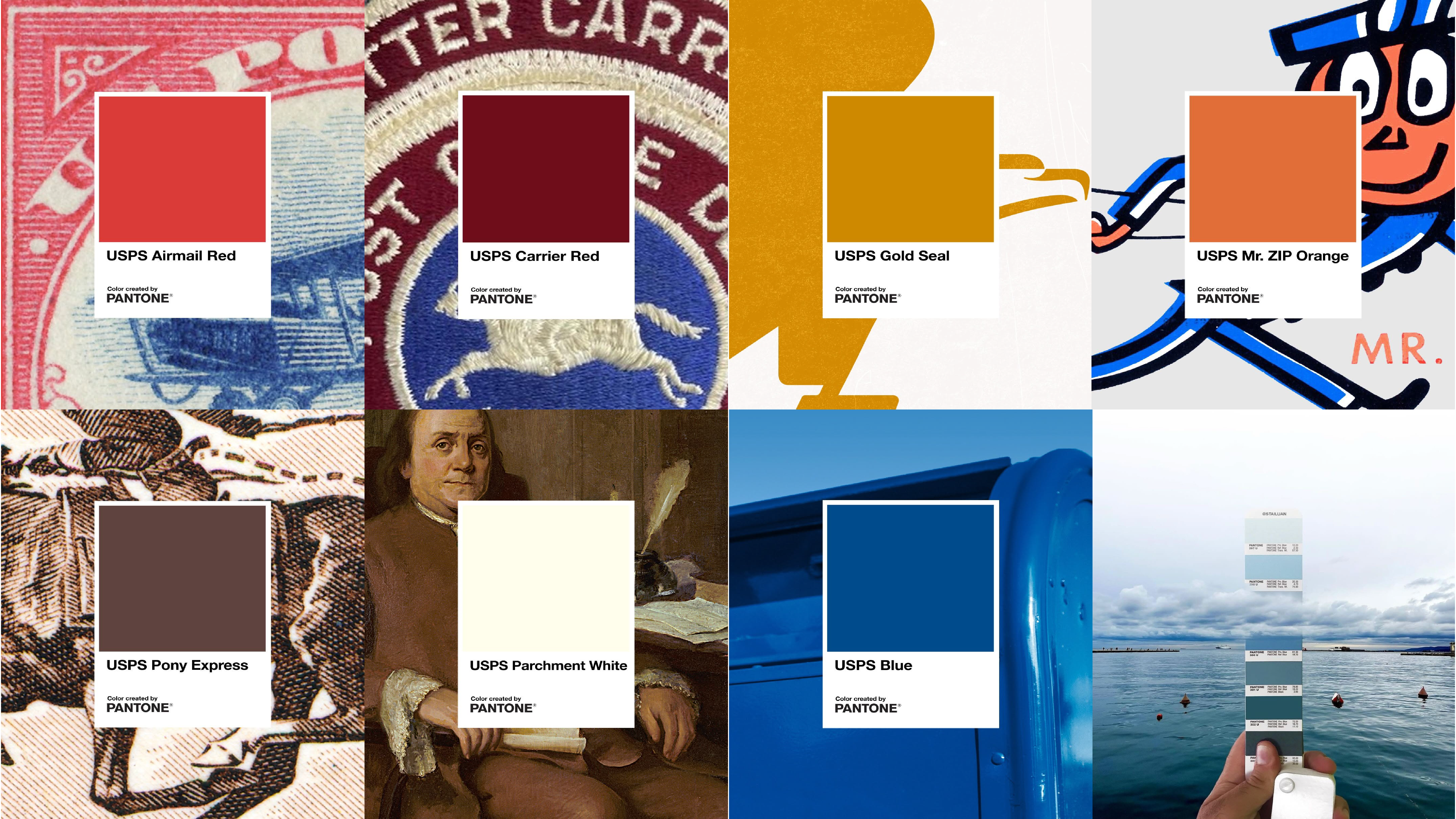
Pantone colors should first be marked clearly in the artwork. Each code can be placed beside the corresponding logo, symbol, text element, border, or solid-color area.
A simple artwork note may appear as:
When several PMS colors are included, each code should be connected to its intended printed element. The drawing can also identify transparent windows, openings, and areas that remain unprinted.
The production team can then review the Pantone references together with the panel dimensions, graphic layout, and printing requirements. During sample confirmation, the artwork and printed appearance are checked as one complete panel design before batch production.
Pantone color matching does not replace the artwork or the printing process. Its main role is to provide a recognizable color reference that can be used throughout the project.
PMS stands for Pantone Matching System, a system that identifies colors through specific names and codes.
Yes. Different Pantone colors can be assigned to logos, text, symbols, backgrounds, and functional color zones according to the artwork.
The complete Pantone codes should be clearly marked beside the corresponding printed areas in the artwork.
Pantone references provide a practical method for communicating color requirements in graphic overlay production. For custom printed panels, please contact Spar Panel with your artwork, panel drawing, and Pantone color information.


