Color information is an important part of the artwork for graphic overlays, acrylic panels, polycarbonate labels, PET labels, and other custom printed panels. A logo may require a clearly defined brand color, while another design may contain gradients, illustrations, or multiple tonal changes.
Two terms often appear when preparing this artwork: Pantone and CMYK. They both help describe color, but they do so in different ways.
Pantone provides an identified color reference that can be used to communicate a specific target color. CMYK creates colors through combinations of cyan, magenta, yellow, and black. Understanding this difference helps buyers and designers prepare clearer artwork and discuss printing requirements more effectively before production.
The Pantone Matching System, commonly known as PMS, assigns specific names or codes to identified colors. Instead of describing a printed area simply as red, blue, or gray, the artwork can reference a particular Pantone color.
This is useful when individual graphic elements need clearly defined color information. Company logos, operating symbols, button markings, borders, functional color zones, and solid backgrounds are common examples.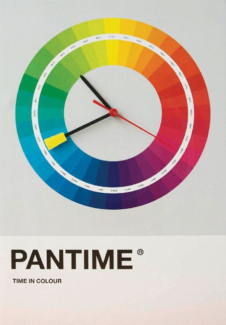
For a custom panel project, the Pantone reference gives the customer and manufacturer a shared point of reference. The code can be marked directly in the artwork beside the corresponding printed area, making it easier to identify which color belongs to each part of the design.
Pantone references are commonly associated with spot colors, where an individual color is treated separately rather than being created only through a four-color process. The Pantone reference itself, however, is still part of the color specification; the actual printing method needs to be reviewed according to the artwork and production requirements.
CMYK takes a different approach.
The letters stand for cyan, magenta, yellow, and black. By using these process colors in different proportions, a printing system can reproduce a broad range of colors without assigning a separate premixed color to every visible shade.
This makes CMYK particularly relevant when artwork contains many colors or gradual color changes. Illustrations, gradients, photographic-style graphics, and designs with multiple tonal transitions are typical examples where process-color artwork may be useful.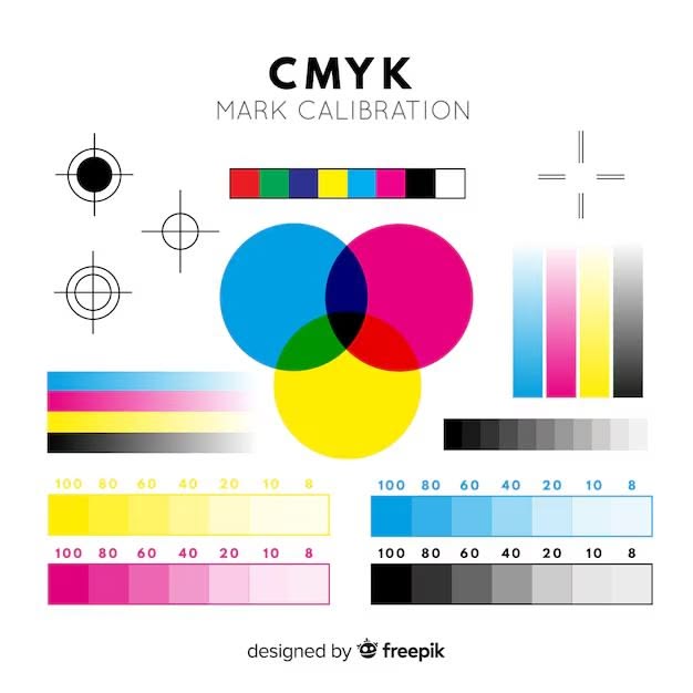
A CMYK file describes each color through percentages of the four color channels. The appearance of the finished print therefore comes from the combination of those channels rather than from one separately identified spot color.
For custom plastic panels, CMYK information should still be considered together with the intended printing method, material, artwork structure, and sample requirements. A CMYK file describes how the color is constructed in the artwork; it does not by itself determine the complete manufacturing process.
The most important difference is how the color is defined.
Pantone starts with an identified color reference. If a customer specifies a Pantone code for a logo or control marking, that code provides a common target for discussing the required color.
CMYK starts with a combination of four process-color values. Instead of specifying one identified spot color, the artwork defines how much cyan, magenta, yellow, and black are used to create the intended appearance.
This difference also affects the types of artwork each approach naturally supports.
A design containing several clearly defined solid colors may be straightforward to communicate with Pantone references. By contrast, artwork containing gradients, photographs, or many tonal variations may be better described through process-color information.
That does not mean one system is universally better than the other. They solve different color communication and artwork needs.
The choice should begin with the artwork rather than with a general rule.
Pantone references are particularly useful when a project contains important solid colors that need to be clearly identified. A brand logo, operating symbol, colored control zone, or background area can each be assigned a specific reference in the artwork.
CMYK becomes more relevant when the design depends on color combinations rather than a limited number of individually specified colors. Gradients, complex illustrations, and image-style graphics are typical situations where process-color artwork may be appropriate.
Some projects may also contain both types of color information. For example, a design may include a defined brand color together with a more complex graphic area. In that situation, the artwork and intended printing method should be reviewed together rather than forcing the entire design into one color system.
The practical question is therefore not simply “Pantone or CMYK?” It is:
How does the artwork need to communicate and reproduce its different color areas?
Once that is clear, the appropriate printing approach can be reviewed according to the panel material, graphic structure, and project requirements.
Clear artwork makes color communication easier before production.
Where Pantone references are required, the complete Pantone codes should be connected clearly to the corresponding logos, text, symbols, borders, backgrounds, or other printed areas.
Where the artwork contains CMYK graphics, the production file should retain the required color information rather than relying only on a screenshot or visual reference.
The drawing and artwork should also distinguish printed areas from transparent windows, cutouts, and other structural features. This allows the color information to be reviewed as part of the complete panel design instead of as an isolated specification.
During sample confirmation, the finished appearance can then be reviewed together with the artwork and panel structure before volume production.
At Spar Panel, printing requirements for custom graphic overlays, acrylic panels, PC/PET labels, and other printed panel parts can be reviewed according to customer artwork and project requirements.
A: No. Pantone identifies colors through defined references or codes, while CMYK creates colors through combinations of cyan, magenta, yellow, and black process colors.
A: No. The appropriate approach depends on the artwork. Pantone references are useful for clearly defined solid colors, while CMYK is commonly used for artwork containing many colors, gradients, or tonal variations.
A: Yes. A design may contain a defined Pantone reference for a logo or functional color while other graphic areas use process-color information. The production approach should be reviewed according to the complete artwork and project requirements.
A: The artwork should clearly identify important color requirements. This may include Pantone references for specified solid colors or CMYK information for process-color graphics, together with the corresponding printed areas in the design.
Pantone and CMYK describe color in different ways, and that difference matters when preparing artwork for custom printed panels.
Pantone provides an identified reference for defined colors, while CMYK builds colors through combinations of four process-color channels. Neither approach is automatically the better choice for every project. The appropriate option depends on the type of graphics, the way colors need to be communicated, and the intended printing requirements.
For custom graphic overlays, acrylic panels, or PC/PET labels, Spar Panel can review the artwork, color references, panel drawing, and printing requirements as part of the project and sample confirmation process.


