Introduction: Printed borders and opaque zones on an acrylic instrument front window control how the display reads and how internal hardware is concealed, so the layout and print method should be decided together rather than left to final artwork.
Printed borders and opaque zones on an acrylic front window do more than decorate. They direct the eye and determine how cleanly the display reads. When you lay out a custom acrylic display panel for an instrument, every area has a job. The display needs a clear window; the bezel and internal light need to disappear behind opaque ink; indicators need their own space; and the brand or model marking needs to sit without competing with the readout. The practical decision is where to block light, where to let it through, and which print method provides the edge quality and color control your design needs.
A printed border is an optical control layer. It frames the active display so the eye lands on the readout rather than the surrounding panel. Opaque black ink around the window hides the display bezel, blocks stray light from the backlight and nearby indicators, and keeps internal edges from showing through the acrylic. On a busy instrument face, that dark frame also separates the display from legends, switch markings, and logo areas. The result is a clear visual hierarchy: readout first, status indicators second, branding last. Border width and window edge position change how that hierarchy feels. A narrow border can look precise and technical, but if it sits too far from the display edge, a bright halo or bezel line may appear. A wider border controls light spill more firmly and gives indicators room to breathe, yet it can make a small display feel cramped if it eats too much of the front area. Surface finish is part of the same decision. A glossy acrylic face makes a black border look deep and sharp, while frosted or anti-glare finishes soften reflections from overhead lighting. The available finishes—glossy, frosted, anti-glare, and anti-fingerprint—change how the border reads under light. A practical design review usually marks four zones: a clear display window, an opaque black border, a separate indicator field, and a logo or model-number area. Draw them together, because moving one edge changes the contrast and balance of the others.
The clearest front windows follow a simple map of visual tasks. Clear PMMA belongs over the display or any area the user must see through. Opaque ink belongs over the bezel, internal seams, light leaks, and any zone that should read as a solid graphic rather than a window. Between those two extremes, a frosted zone can provide subtle separation, but the main decision is binary: this area passes light, or it blocks it. Settle that map before finalizing artwork detail. Window-edge contrast determines whether the display reads as a clean aperture. The printed border should meet the clear window on a clean line that matches the display’s active area or the visible aperture. Indicator spacing also matters. Small status LEDs placed too close to the border can look like part of the frame; give them their own opaque field or a dedicated icon zone. Logo and model marks should sit in an opaque area or a quiet clear area, never across the boundary where they compete with the display. On a printed acrylic front panel, this division gives the printer a clear artwork file: one window, one light-blocking border, separate graphic fields, and clearly defined semi-clear regions. That clarity makes the finished panel look intentional.
Screen printing and digital printing solve different graphics problems. Screen printing applies a solid, even ink layer, making it the natural choice for solid light-blocking borders, dense black frames, repeated legends, and large color fields that must read consistently across a production run. Digital printing is better for variable artwork, fine detail, gradients, small serialized markings, and short runs where the design may change between versions. Many instrument windows use both: screen printing for the opaque border and core legends, digital printing for the variable or high-detail layer.
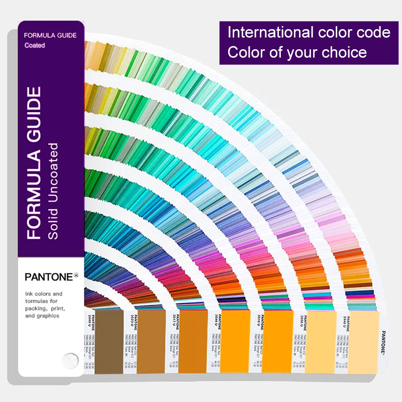
Surface preparation belongs in print planning too. A clean, controlled PMMA surface gives the ink a consistent base. Ink adhesion, color tolerance, and pencil hardness are not stated in Spar Panel specification No. 47; confirm them with the printing team and a physical printed sample. The print team can review your artwork against the window layout, color references, and surface choice, then build a sample that shows the real border edge, legend sharpness, and black density. Spar Panel supports both screen printing and digital printing, with a maximum print size of 1300×700 mm and Pantone matching in the screen-printing workshop.
The print plan for an instrument front window works best when it follows the visual tasks. Let the display see through, let the border block light, let indicators sit in their own fields, and let the logo stay quiet. Then choose the print method by artwork detail, opacity need, color control, and how often the design will change. Spar Panel, an acrylic display panel manufacturer, can review a custom acrylic display panel layout, recommend screen or digital printing, and produce a physical sample so you can judge the border edge, surface finish, and color in your hand. Send your artwork, window layout, and target Pantone references to start that review.
A: Use screen printing for solid opaque borders, dense black frames, and stable legends that must hold color across a run. Use digital printing for variable graphics, fine detail, gradients, and short runs. Many instrument windows combine both: screen printing for the light-blocking border and core markings, digital printing for variable or high-detail artwork.
A: An opaque printed border acts as a light mask. It covers the display bezel, internal seams, and backlight bleed so the active window reads as a clean rectangle. A wider, denser border controls stray light more firmly, while a narrow border gives a sharper technical look. The best width depends on the display size, surrounding graphics, and the contrast you want around the readout.
A: Yes. A screen-printed acrylic display panel can keep the display area clear while printing opaque borders, legends, indicator fields, and logo zones around it. Define each zone clearly in the artwork so the printer knows where light must pass and where it must be blocked. Review surface finish and color references on a physical sample before production.
Everything You Need to Know About Acrylic (PMMA) | Xometry
The Science of Adhesion: Bonding & Assembly Education | 3M
Custom Acrylic Display Panel for Control Devices | Spar Panel