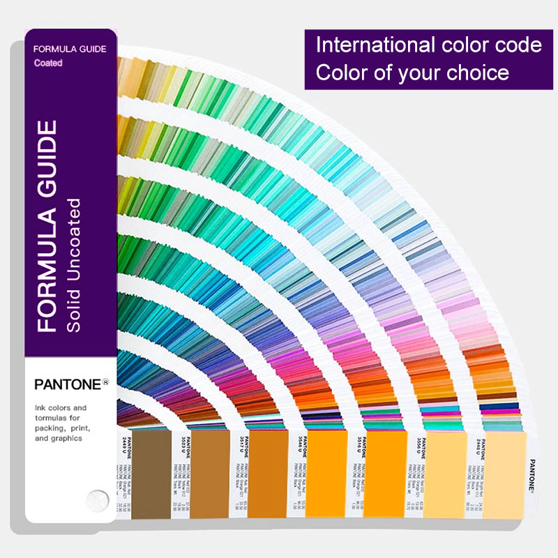
A Pantone reference or artwork color defines the intended color, but it does not by itself determine exactly how that color will look on a finished transparent plastic panel.
When graphics are printed on acrylic, polycarbonate, PET, or another transparent substrate, the visible result is influenced by more than the ink. The substrate, printing side, white backing structure, surface finish, background behind the panel, and lighting conditions can all affect how the finished color is perceived.
This is why the same color reference can look different on two panel structures even when the artwork uses the same target color.
Printed color + substrate + background + surface + lighting = final visual appearance.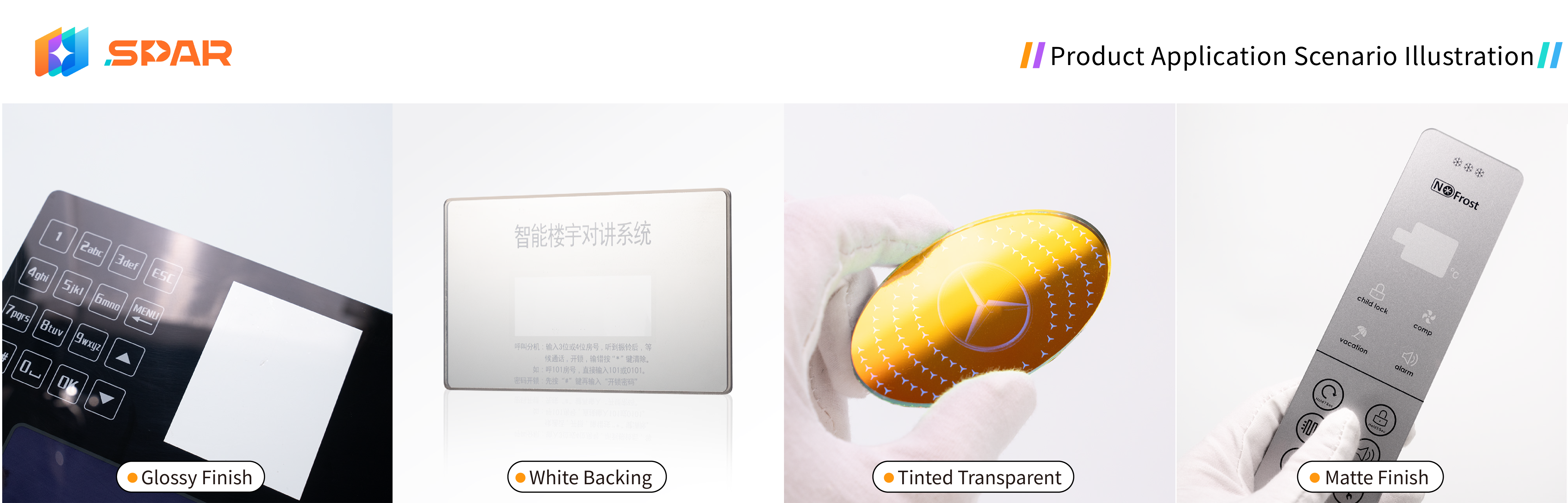
Printing on a transparent plastic panel is different from printing on an opaque white surface.
When the material is transparent, the viewer may see the printed graphics through the substrate. The substrate therefore becomes part of the optical path between the printed ink and the viewer.
Its clarity, tint, thickness, and surface appearance can influence the finished visual result.
The background behind the printed area can also matter. If a printed color does not have an opaque backing layer, the equipment housing, display structure, or other color behind the panel may influence what the user sees through the transparent material.
For this reason, color on a transparent panel should be evaluated as part of the complete panel construction rather than as an isolated ink color.
White is often used behind printed colors on transparent substrates when the design requires a more controlled background.
Without an opaque backing layer, some printed colors may remain partly influenced by the transparent substrate and whatever is positioned behind it.
Adding a white backing layer can reduce this influence and provide a more consistent visual base for the color printed above or in front of it.
However, white backing should not be treated as a guarantee that every printed color will reproduce identically across different panel structures.
The opacity of the white layer, printing sequence, ink system, substrate, and other printed layers can still affect the result.
For this reason, the complete printing structure should be confirmed rather than specifying only the visible color.
Front printing places the printed graphics on the outward-facing surface of the panel.
In this structure, the viewer sees the printed ink directly.
Reverse printing places the graphics on the back side of a transparent substrate, so the user views the color through the plastic material from the front.
That difference changes the viewing path.
With reverse printing, the substrate thickness, transparency, tint, gloss, and surface reflections can all influence the appearance of the printed color before it reaches the viewer.
This does not mean that front printing or reverse printing is automatically better for color reproduction. The two structures create different visual and physical results.
Reverse-printed color is viewed through the substrate, so the substrate itself becomes part of the finished appearance.
The printing direction should therefore be selected according to the panel design, artwork, transparent areas, surface requirements, and intended viewing effect.
Surface finish can also change how a printed color appears even when the ink formulation remains unchanged.
A glossy surface produces stronger specular reflections and can make colors appear visually brighter or more vivid under some lighting conditions. At the same time, reflected light from lamps, windows, or surrounding objects may interfere with the way the color is viewed.
Matte or frosted surfaces scatter more light. This can soften reflections, but it can also make the same printed graphics appear visually different from those viewed through a smooth glossy surface.
The important point is that the ink itself may not have changed.
The perceived color changes because the surface changes how light reaches and leaves the panel.
For appearance-sensitive projects, the specified surface finish should therefore be included in sample confirmation rather than reviewing color on a different surface.
A transparent substrate does not always need to be completely clear.
Smoked, gray, black-tinted, or other colored transparent panels can be used when the equipment design requires a darker or more integrated appearance.
In these structures, the tint of the material itself becomes another part of the final visual result.
A light-colored printed graphic viewed through a smoked panel may not look the same as the same graphic viewed through clear material. White, gray, and other lighter colors can be especially sensitive to the surrounding optical structure.
This is another reason why the color target should be evaluated on the actual substrate intended for production.
A printed panel does not look exactly the same under every light source.
Daylight, warm indoor lighting, cool LED lighting, and backlighting can change the way the same printed color is perceived.
Backlit structures create an additional difference because light is passing through the material and printed layers rather than only reflecting from the front surface.
A color approved under normal room lighting may therefore appear different when the panel is illuminated from behind.
For backlit panels, it can be useful to review both conditions:
The objective is not to make both states look identical. It is to confirm that the appearance in each state matches the intended panel design.
For custom printed panels, color control should not stop at identifying a Pantone code or checking the artwork on a screen. The printed result needs to be compared with the reference that has actually been approved for the project.
At Spar Panel, color requirements are first confirmed from the customer artwork, Pantone reference, approved sample, or other agreed visual reference. If the customer provides revised artwork before production, the new file should be reviewed again rather than assumed to be identical to the previously approved version.
During sampling, the printed appearance is checked together with the actual substrate, printing structure, surface finish, and viewing side. For transparent or tinted panels, the observation background can also affect how the color appears, so the finished panel should be evaluated as a complete visual structure rather than as an isolated ink layer.
Once the sample is approved, it becomes an important reference for subsequent production. First-article and production inspection should compare the finished appearance with the approved sample and confirmed artwork, instead of checking only dimensions or individual process parameters.
The practical control path is:
Customer color requirement → artwork review → printed sample → customer approval → first-article comparison → production inspection
This approach helps keep color evaluation tied to the actual product structure and to the reference already confirmed by the customer.
If the artwork, material, printing structure, or other appearance-related requirement changes after sample approval, the affected visual result should be reviewed again before volume production continues.
Color confirmation is most useful when the sample reproduces the same structure planned for volume production.
Where possible, the sample should use:
If the finished product uses reverse printing, a front-printed sample should not be treated as an equivalent visual reference.
Similarly, a color sample printed on clear material may not fully represent the same artwork when production uses a smoked or tinted substrate.
For appearance-sensitive projects, sample approval should therefore focus on the finished panel structure rather than color information alone.
Clear project information helps reduce unnecessary color revisions during sampling.
Useful information can include:
physical reference samples when the visual target is especially important.
These details allow the printed color to be reviewed together with the actual panel construction.
At Spar Panel, color references, printing direction, material, surface finish, and other printing requirements can be reviewed according to the customer artwork and project structure before volume production.
A Pantone code provides a target color reference, but the final appearance is also affected by the transparent substrate, printing structure, background, surface finish, and lighting. The physical sample shows how the target color appears in the actual panel construction.
A white backing layer can reduce the influence of the background behind a transparent substrate and provide a more controlled base for printed colors. The final result still depends on the white opacity, ink system, substrate, printing sequence, and complete panel structure.
If the finished panel will be backlit, both illuminated and non-illuminated conditions should be reviewed when possible. Backlighting changes how light passes through the substrate and printed layers, so the visual appearance can differ from normal room-light inspection.
Printed color on transparent plastic is determined by more than the ink itself.
The substrate, white backing structure, printing direction, surface finish, tint, background, and lighting conditions all contribute to the final appearance.
Pantone and CMYK information remain important for communicating the intended color, but a physical sample provides the most useful confirmation of how that color works within the finished panel structure.
For custom printed plastic panels, Spar Panel can review customer artwork, color references, material requirements, printing direction, surface finish, and sample requirements before volume production.